2026/04/10 - 26일차 | 기본 시각화,
[ 기본 시각화 ]
1. plot
- 선그래프, 산점도
- 데이터프레임의 교차 산점도
- 모델 시각화
2. barplot
- 범주형 데이터의 비교 시각화(y축:수치형, x축:범주형)
barplot(height,                 # 데이터(벡터, 행렬)
        width = 1,              # 막대 너비
        space = NULL,           # 막대 공간
        names.arg = NULL,       # 막대 이름
        legend.text = NULL,     # 범례
        beside = FALSE,         # 서로 다른 막대로의 출력 여부
        horiz = FALSE,          # 수평 여부
        density = NULL,         # 빗금농도
        angle = 45,             # 빗금각도
        border = par("fg")      # 테두리
        ...)
예) 여러 막대그래프 출력(벡터)
p1 <- c('#990000', '#0000ff', '#ff00ff', '#00cc00', '#ff8000')

barplot(c(15,60,30,80,100), col = rainbow(5),
        names.arg = c('A','B','C','D','E'),
        density = 80, angle = 90, horiz = T)
예) 여러 막대그래프 출력(2차원)
windowsFonts(
  dongle = windowsFont("Noto_Sans")     # 다운로드한 폰트를 임의의 이름으로 등록
)
par(family = 'Noto_Sans')                                     # 위에서 등록한 폰트이름으로 설정
windowsFonts()

library(googleVis)
library(reshape2)
df1 <- dcast(Fruits, Date ~ Fruit, value.var = 'Sales')
rownames(df1) <- df1$Date
df1$Date <- NULL
par(bg = '#F8F9F8')
par(family = 'Noto_Sans')
dev.new()
barplot(as.matrix(df1), beside = T, col = rainbow(3),
        ylim = c(0,150),
        cex.axis = 1.5, cex.names = 1.5,
        xlab = 'Fruit', cex.lab = 2, col.lab = 'red',
        main = '과일별 판매량 비교', cex.main = 3)

legend('topright', inset = c(0.03, 0),
       legend = rownames(df1), fill = rainbow(3),
       title = '연도')
[ 연습문제 - barplot 시각화 ]
더보기
영화이용현황.csv 파일을 읽고
요일별 각 연령대의 영화이용비율을 비교하는 막대그래프 시각화
단, 연령대는 10대, 20대, ..., 60세이상 으로 범주화
# 데이터 불러오기
movie <- read.csv('영화이용현황.csv', fileEncoding = 'cp949')
unique(movie$연령대)

# 기초 데이터 생성
# 1) 연령대 가공
library(stringr)
v1 <- str_c(str_sub(movie$연령대,1,1), '0대')
movie$연령대 <- str_replace(v1, '60대|70대','60세이상')

# 2) 요일
movie$요일 <- str_c(movie$년,movie$월,movie$일,sep='/') |> as.Date() |> strftime('%A')

# 3) wide data 생성
library(reshape2)
total <- dcast(movie, 연령대 ~ 요일, sum, value.var = '이용_비율...')
rownames(total) <- total$연령대
total$연령대 <- NULL

# 4) 컬럼 재배치
total <- total[,c(4,7,3,2,1,6,5)]


# 시각화
windowsFonts(
  han = windowsFont("서울한강체 B")     # 다운로드한 폰트를 임의의 이름으로 등록
)
par(family = 'han')

library(colorspace)
p1 <- sequential_hcl(6, 'ag_Sunset')

dev.new()
par(bg = '#F8F9F8')
par(family = 'han')
par('mar' = c(6,6,6,3))
barplot(as.matrix(total), beside = T, col = p1, las = 1, ylim = c(0,9),
        main = '요일별 연령대별 영화 이용비율 비교', cex.main = 2.5,
        xlab = '요일', cex.lab = 1.5)

mtext('이용비율(%)', side = 2, at = 8.5, las = 1, cex = 1.2)

legend('topright', inset = c(0.03, 0.08), ncol = 3, bg = '#EFEBE8',
       legend = rownames(total), fill = p1, cex = 0.7,
       title = '연령대', title.cex = 1, title.col = 'red')
3. 상자그림
- 수치형 데이터의 분포 비교 시각화
- IQR 기준으로 이상치 출력
- 최대, 최소, 이상치, Q3, Q1, IQR, median(Q2) 확인 가능
** IQR 기준 이상치 탐색 방법
1) 상한 이상치: 이상치 > Q3 + 1.5*IQR
2) 하한 이상치: 이상치 < Q1 - 1.5*IQR
** 상자 그림 시각화
boxplot(iris[,-5], col = p1[1:4], las = 1,
        main = 'Box Plot', cex.main = 2,
        xlab = 'Species', cex.lab = 1.5,
        cex.axis = 0.8)
** 이상치 확인
summary(iris[,-5])
q1 <- quantile(iris$Sepal.Width)[2]
q3 <- quantile(iris$Sepal.Width)[4]
viqr <- q3 - q1

r1 <- iris[iris$Sepal.Width > q3 + 1.5*viqr, ]
r2 <- iris[iris$Sepal.Width < q1 - 1.5*viqr, ]
outlier <- rbind(r1,r2)
** 이상치 번호 출력
text(2.1, outlier$Sepal.Width, rownames(outlier), cex = 0.7)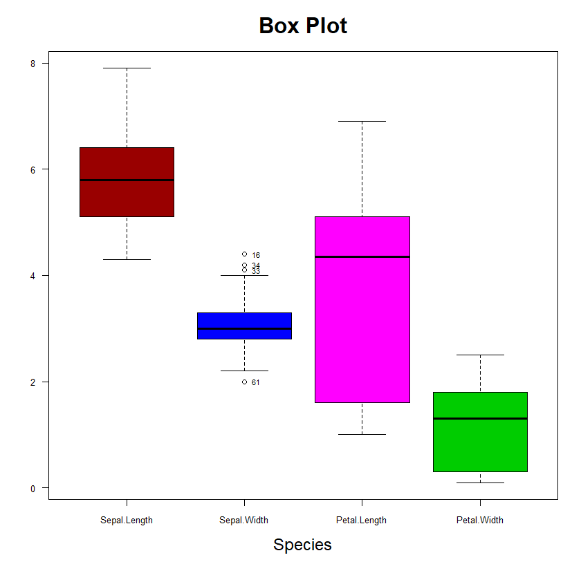
4. 히스토그램
- 도수분포표를 시각화한 그림
- 수치형 데이터에 대한 분포 확인 시각화(계급별로 막대로 표현)
hist(x,                          # 데이터(벡터)
     breaks,                     # 계급구간
     freq = T,                   # y축 좌표 -> 도수
     probability = F,            # y축 좌표 -> 확률
     include.lowest = TRUE,      # 최솟값을 첫번째 계급 포함 여부
     right = T)                  # 오른쪽 닫힘 여부( a초과 b이하)
도수분포표
140 ~ 150 => 140이상 150미만( [140,150) : left closed) or 140초과 150이하( (140, 150] : right closed)
150 ~ 160
160 ~ 170
170 ~ 180
180 ~ 190
vheight <- c(140,142,150,155,158,162,168,169,170,171,177,176,177,183)
hist(vheight)
hist(vheight, seq(130,200,10), probability = T)
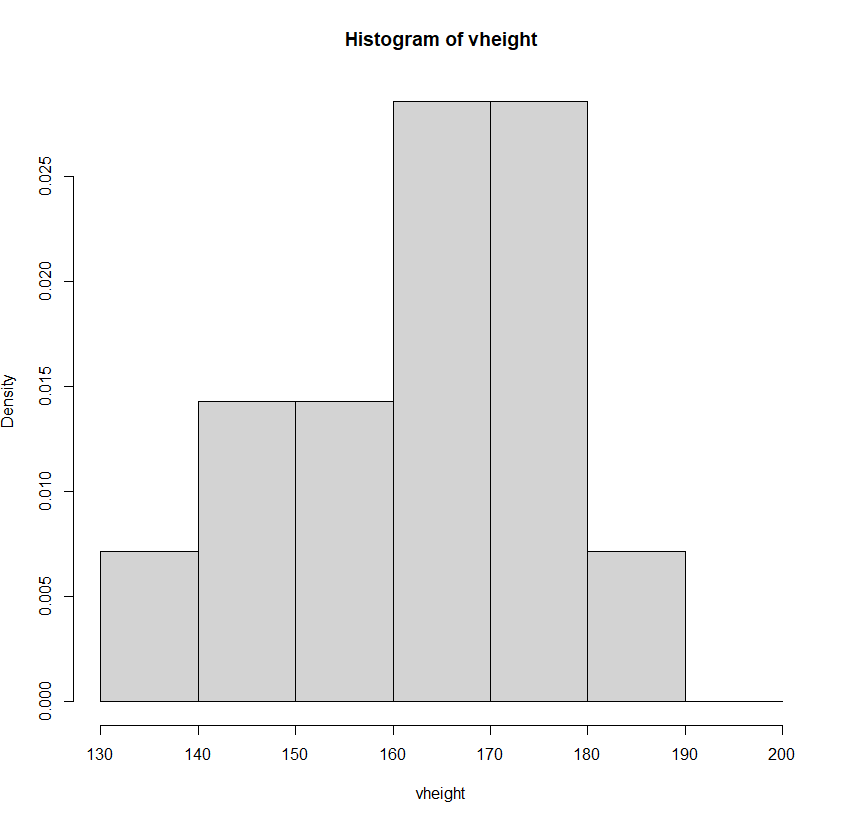
5. 커널밀도함수(kde)
install.packages('ks')
library(ks)

par(mfrow = c(1,2))     # 2분할
hist(vheight, seq(130,200,10), probability = T)
plot(kde(vheight))
6. 파이차트
- 범주형 자료의 수치를 비교하기 위한 시각화 기법
pie(x,                                    # 데이터(벡터)
    labels = names(x),                    # 각 파이 이름
    edges = 200,                          # 경계선의 부드러움의 정도
    radius = 0.8,                         # 반지름
    clockwise = FALSE,                    # 데이터의 출력 방향(시계방향 여부)
    init.angle = if(clockwise) 90 else 0)
예제) 기본 파이차트 그리기
더보기

v1 <- c(80,20,60,40)

par(mfrow = c(1,1))
pie(v1, c('A','B','C','D'), col = rainbow(4), clockwise = T,
    radius = 0.6, main = 'Pie Chart')
legend('topright', c('A','B','C','D'), fill = rainbow(4))
7. 3D 파이차트
install.packages('plotrix')
library(plotrix)

pie3D(x,
      radius = 1,
      height = 0.1,       # 파이높이
      start = 0,
      labels = ,
      labelcol = ,
      labelpos = ,
      labelcex = ,
      explode = 0)        # 파이간격
더보기

pie3D(v1, labels = c('A','B','C','D'), col = p1[1:4],
      radius = 1, main = 'Pie Chart', explode = 0.1)

legend('topright', c('A','B','C','D'), fill = p1[1:4],
       title = '업종')
[ 연습문제 - 파이차트 시각화 ]
더보기
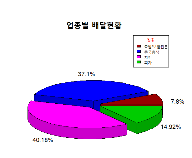
delivery.csv 파일을 사용하여delivery.csv
업종별 통화건수의 총 비율을 파이차트 시각화
deli <- read.csv('delivery.csv', fileEncoding = 'cp949')

# 기초 데이터 생성
library(plyr)
deli2 <- ddply(deli, .(업종), summarise, 총통화건수 = sum(통화건수))
total <- deli2$총통화건수
names(total) <- str_remove(deli2$업종, '음식점-')
vnames <- str_c(round(total/sum(total) * 100,2), '%')

# 시각화
pie3D(total, col = p1[1:4], height = 0.08,
      explode = 0.1, radius = 0.9,
      main = '업종별 배달현황', cex.main = 2,
      labels = vnames, labelcex = 1.2)
legend('topright', names(total), fill = p1[1:4], cex = 0.9,
       title = '업종', title.col = 'red')
26일차 실습 문제 풀이
링크첨부예정


